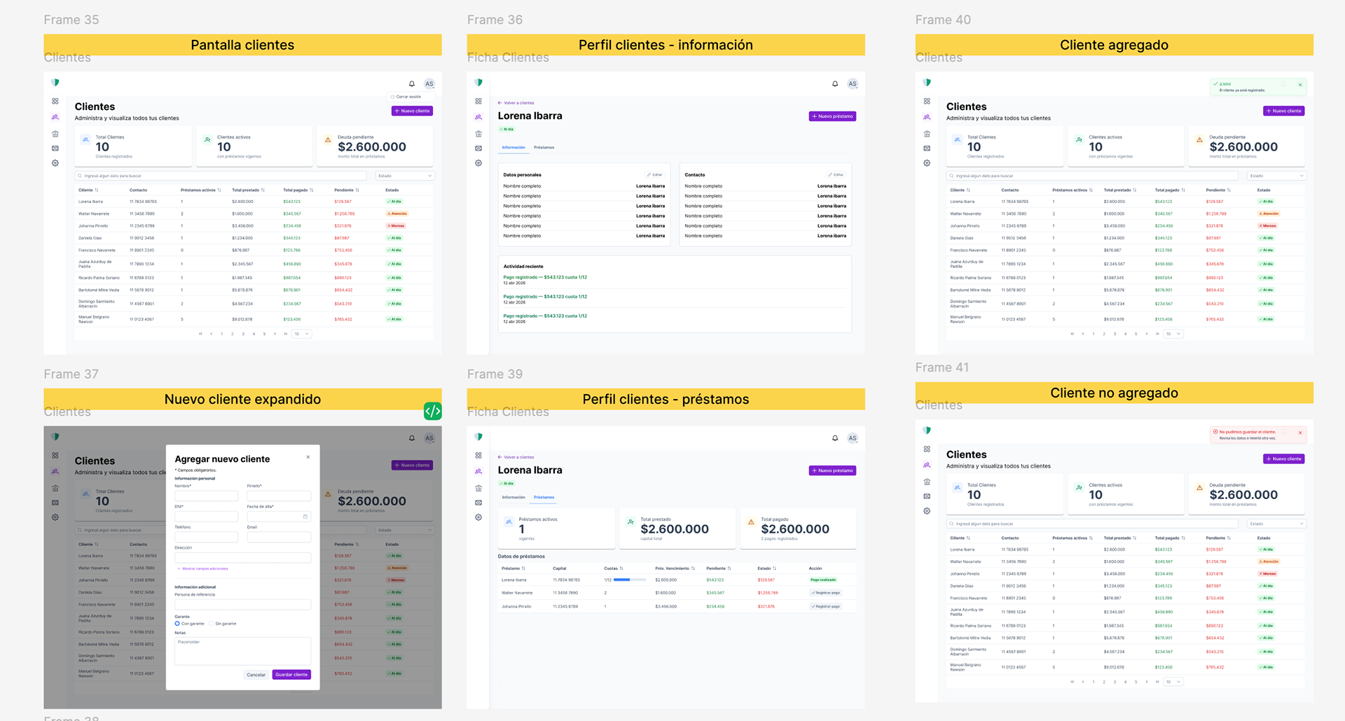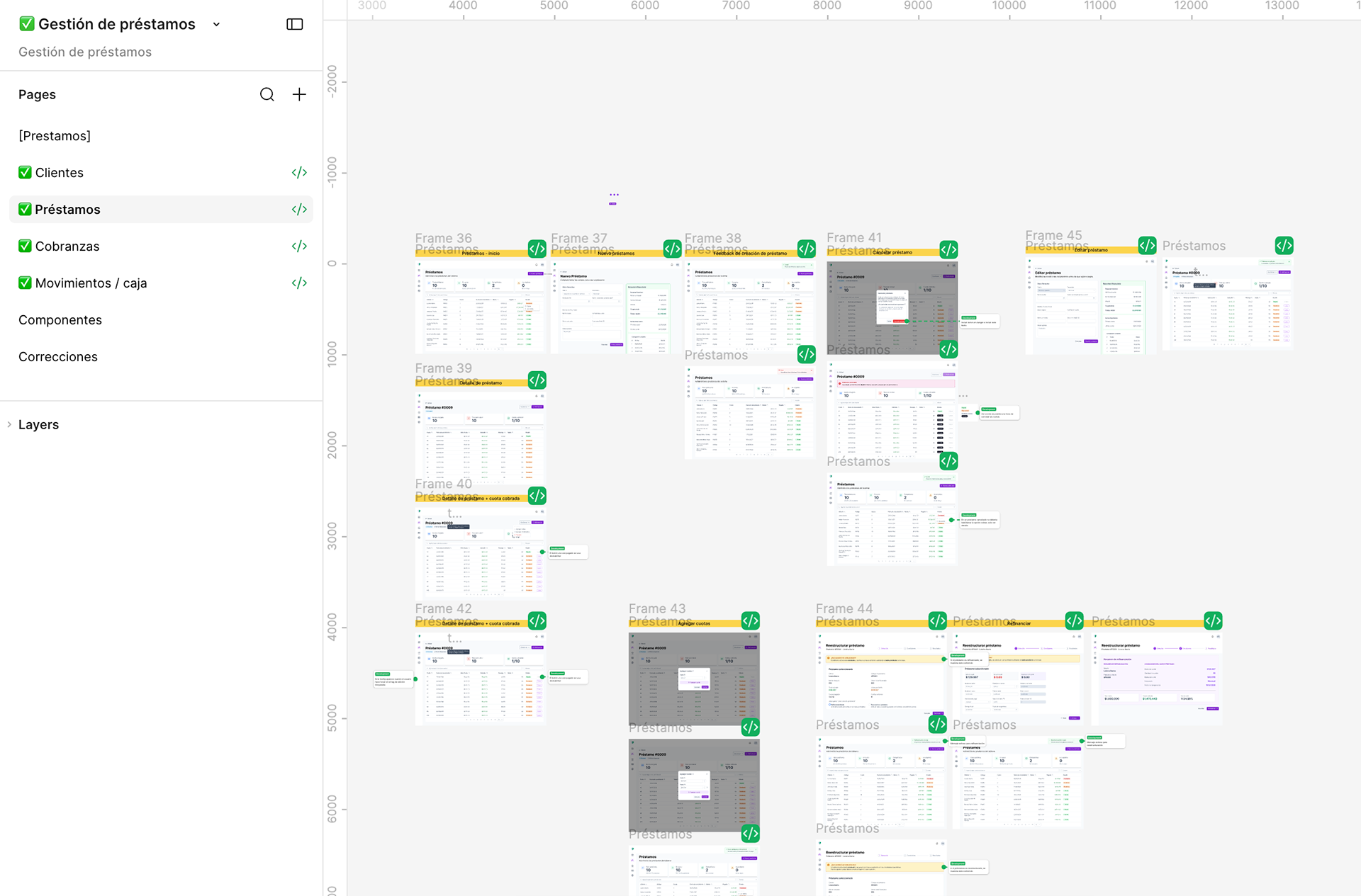
Four modules, one system: clients, loans, collections and cash.
Project Overview
Designing a reliable enterprise platform with an AI-native workflow.
The short version
* Problem — A lending business with no durable record. One broken laptop erased it.
* Constraint — Development had already started. I designed into a system in motion,
not a blank file.
* Approach — Module by module, using the client's surviving spreadsheet as the
discovery document.
* Outcome — Four modules designed, delivered and QA'd against the real build.
Borrower-facing access is next.
Designing a reliable enterprise platform with an AI-native workflow.
The project started with a simple request: replace a spreadsheet that had become the backbone of an entire lending business.
The spreadsheet wasn't just storing information—it was running the company. Clients, loans, collections, payments, cash flow. Everything lived in one file. It worked until it didn't.
The owner had already experienced data loss once, and rebuilding everything manually changed the way he looked at software. The challenge wasn't simply digitizing a process—it was designing a product that felt trustworthy enough to replace something he depended on every day.
To accelerate the design process, I adopted an AI-native workflow, using Claude to synthesize requirements, explore interaction patterns, refine UX writing, and document design decisions. I used Figma Make to rapidly prototype and iterate on complex enterprise workflows, allowing ideas to evolve quickly while keeping every decision grounded in real user needs and business constraints.
The short version
* Problem — A lending business with no durable record. One broken laptop erased it.
* Constraint — Development had already started. I designed into a system in motion,
not a blank file.
* Approach — Module by module, using the client's surviving spreadsheet as the
discovery document.
* Outcome — Four modules designed, delivered and QA'd against the real build.
Borrower-facing access is next.
Understanding the workflow
Before opening Figma, I spent time understanding how the business actually operated.
Rather than recreating the spreadsheet digitally, I mapped the relationships between clients, loans, collections, payments, and cash movements to understand where complexity originated.
Using Claude, I synthesized business requirements and explored different information architecture alternatives, helping transform fragmented processes into a scalable SaaS structure before moving into interface design.
The goal wasn't to make the spreadsheet prettier.
It was to build software that people could trust.
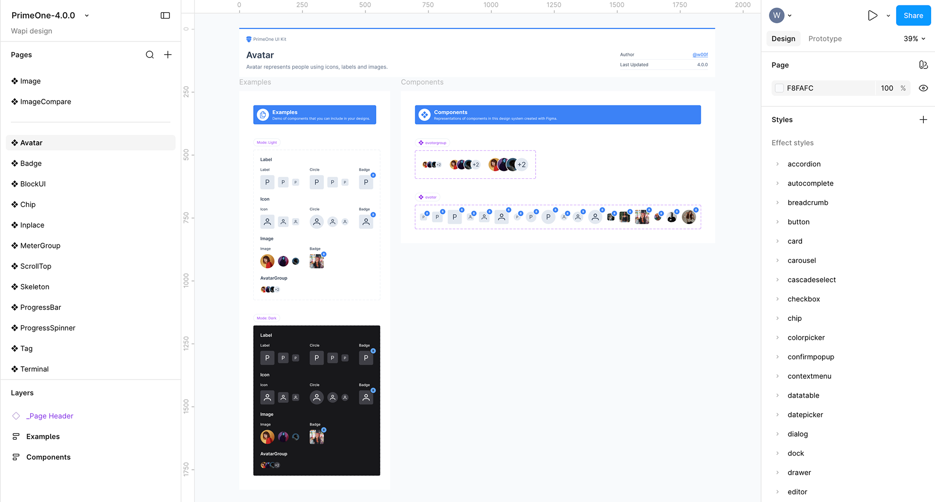
The kit as purchased.
Designing the experience
Progressive disclosure instead of overwhelming forms
The spreadsheet required every piece of information immediately.
The platform doesn't.
Adding someone quickly only requires four fields. Completing the full customer record remains possible, but only when it's relevant.
Instead of forcing users through long forms, the interface adapts to their workflow, reducing cognitive load while preserving flexibility.
Throughout exploration, I leveraged Claude to evaluate different interaction patterns and UX writing approaches before defining the final flow.
Design system: a delivery decision, not an aesthetic one
We chose Prime One, and we chose it together, before a single screen was designed.
The reasoning was simple. The developer was building in Angular, and PrimeNG was the library that suited him best. If I designed with that library's own kit, every component I handed over already had a counterpart in code — under the same name.
In practice, datatable, paginator, inputtext, toast and tabs meant the same thing in Figma and in the repo. Handoff stopped needing translation.
What I adapted:
* Replaced the kit's default purple with the client's brand colour and rebuilt the derived palette around it.
* Built from scratch the components the kit didn't ship: summary cards, data lists and alerts. Prime One is a UI kit more than a design system — it gives you parts, not principles — so I built these following its own token logic, to keep them from reading as grafts.
What I adapted:
* Replaced the kit's default purple with the client's brand colour and rebuilt the derived palette around it.
* Built from scratch the components the kit didn't ship: summary cards, data lists and alerts. Prime One is a UI kit more than a design system — it gives you parts, not principles — so I built these following its own token logic, to keep them from reading as grafts.
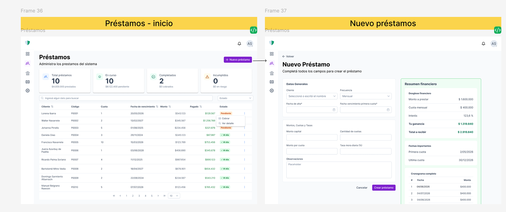
Creating a loan takes the full screen. High stakes deserve undivided attention.
Design decisions
1. How much decision to put inside the table
The clients table was the most settled part of the product from day one: the architecture already defined it and the structure worked.
The question wasn't how it looked. It was how many actions to give the user inside it.
A table can become a control centre — inline editing, status changes, quick actions. But every action you add is another decision the user has to make while scanning rows.
We decided the table would do one thing well — find someone and open them — and that anything with consequences would live in the client record or in a flow of its own.
Decidimos que la tabla hiciera una sola cosa bien —encontrar y entrar— y que las acciones con consecuencia vivieran en la ficha del cliente o en flujos propios.
2. Adding a client, in two levels
Creating a client asks for a lot: personal details, contact, guarantor, notes. All at once, it's a form that's exhausting before you start.
I split it into two levels inside the same panel: personal information always visible, additional information revealed only when needed.
Adding someone quickly is four fields. Filling out the complete record is still there — it just isn't imposed on you.
3. New loan gets its own screen
This is where I broke the product's own pattern.
Everything else works through side panels over the table: you see the list and work on top of it. But creating a loan isn't like adding a contact. It's the highest-stakes moment in the business — amounts, terms, interest, instalments, collateral. A mistake here follows you for months.
Creating a loan takes over the full screen, as a separate flow. Pulling it out of the table's context wasn't a visual choice: it was a way of telling the user that what they're about to do is different and deserves their attention.
4. What the summary cards should show
The cards produced the longest discussion and the least code.
Three numbers at the top of each module. The question was which three. It's the first thing he sees when he opens the system, and it's effectively the answer to "how am I doing?".
5. Where cash lives
Cash was the hardest module to place.
Every payment recorded in Collections is also a movement of money. Every loan granted is money going out. So: is Cash a view of what happens in the other modules, or a place where you also record things that don't come from any loan at all?
That was an architecture question, but the answer changed the experience completely. We worked it out together.
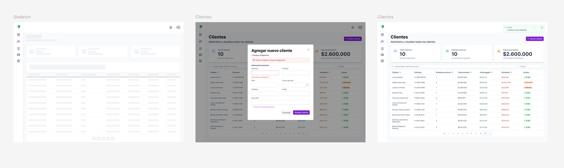
Loading, confirmed, failed. For someone who already lost his records once, these aren't details.
Designing for trust
The original request wasn't simply stability.
It was confidence.
Every interaction was designed around the moments where users could lose trust in the system.
Loading skeletons communicate progress instead of leaving blank screens.
Every successful action returns explicit confirmation.
Failed operations never destroy user input. Forms preserve information, display clear feedback, and allow users to recover without starting over.
Every successful action returns explicit confirmation.
Failed operations never destroy user input. Forms preserve information, display clear feedback, and allow users to recover without starting over.
During the design process, I used Claude to refine UX writing and system messaging, ensuring every interaction reinforced clarity, transparency, and confidence.
For someone who had already rebuilt an entire business after losing data, these weren't micro-interactions.
They were the foundation for replacing a spreadsheet with software he could rely on.
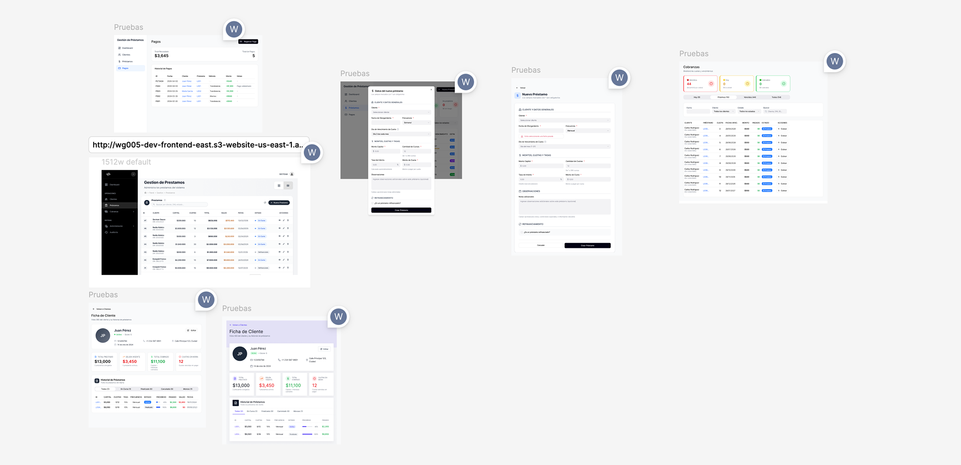
The built product imported back into Figma, marked up against the design.
Design QA against the real build
As development progressed, I continuously reviewed the implemented product to ensure the final experience matched the design intent.
Using html.to.design, I imported production screens back into Figma and created a dedicated QA workspace to compare implementation against the original designs.
Rather than documenting isolated UI issues, I built a collaborative review process that highlighted differences across spacing, hierarchy, interaction states, and component behavior.
This collaborative workflow significantly improved communication between design and development while maintaining implementation quality.
Outcome
The platform is ⟦in production / in development — confirmame⟧ and the client no longer depends on a file sitting on a single machine.
There are no usage metrics yet. What I do have is what happened as we delivered. He had been looking at development screens — functional, undesigned, built to validate logic. When the first designed module landed, something shifted. He stopped treating it as a tool and started treating it as his product.
What's next: today the system is his alone. The next phase opens access to borrowers, so they can see their loan, their instalments and their payments without having to ask him over WhatsApp.
What's next: today the system is his alone. The next phase opens access to borrowers, so they can see their loan, their instalments and their payments without having to ask him over WhatsApp.
Beyond delivering a functional enterprise platform, this project demonstrated how an AI-native design workflow can accelerate research, product discovery, UX writing, design exploration, and rapid prototyping without compromising thoughtful product decisions.
By combining Claude for ideation and content refinement with Figma Make for rapid prototyping, I was able to iterate faster while keeping every design decision grounded in user needs and business goals.