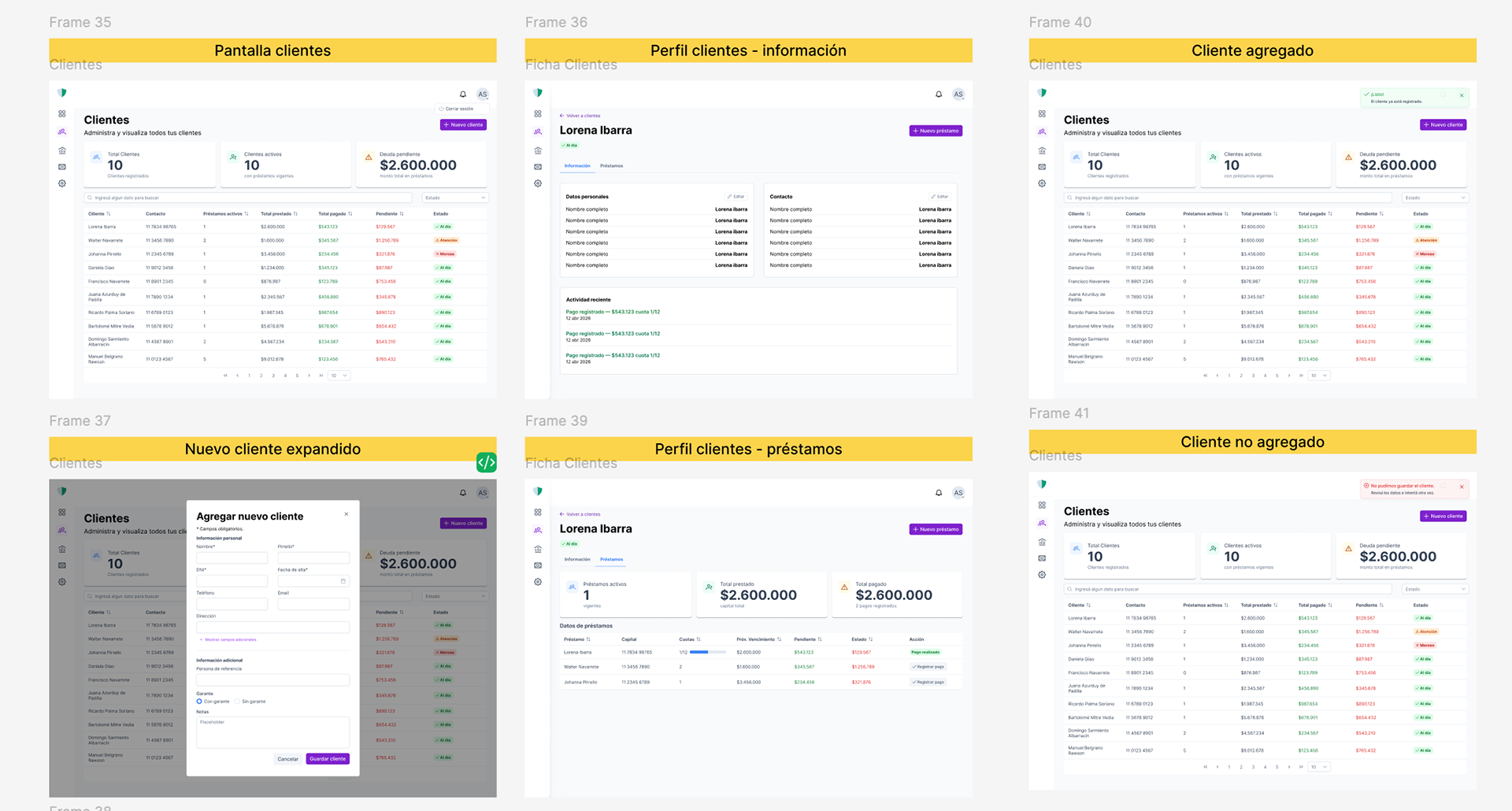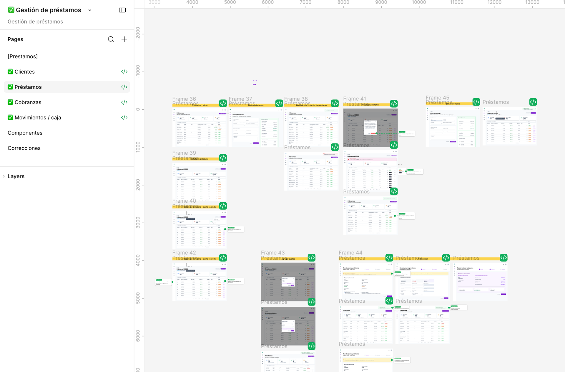
Four modules, one system: clients, loans, collections and cash.
Project Overview
His computer broke and his business disappeared. Designing a platform to manage loans, installments, collections and cash — on top of an architecture that was already under construction.
Role: Product Designer
_____________________________________
His computer broke and his business disappeared. Designing a platform to manage loans, installments, collections and cash — on top of an architecture that was already under construction.
Role: Product Designer
_____________________________________
Team: One developer/architect and me
_____________________________________
Duration: 2 months
_____________________________________
Year: 2026
_____________________________________
Client: Independent lender, Argentina.
_____________________________________
Tools: Figma, Prime One UI Kit, Claude
_____________________________________
Delivered: Four modules, an adapted design system,
and design QA against the dev environment
The short version
* Problem — A lending business with no durable record. One broken laptop erased it.
* Constraint — Development had already started. I designed into a system in motion,
not a blank file.
* Approach — Module by module, using the client's surviving spreadsheet as the
discovery document.
* Outcome — Four modules designed, delivered and QA'd against the real build.
Borrower-facing access is next.
and design QA against the dev environment
The short version
* Problem — A lending business with no durable record. One broken laptop erased it.
* Constraint — Development had already started. I designed into a system in motion,
not a blank file.
* Approach — Module by module, using the client's surviving spreadsheet as the
discovery document.
* Outcome — Four modules designed, delivered and QA'd against the real build.
Borrower-facing access is next.
Context
My client lends money informally. He isn't a bank or a finance company — he's one person with a book of borrowers, terms negotiated case by case, and a collections schedule that lives in his head.
All of it sat in a spreadsheet. One file, on one computer.
Until the computer broke.
He lost the full record of who owed him what, how much he had collected and how much was left in cash. He rebuilt part of it by scrolling back through old WhatsApp threads: loose amounts, approximate dates, promises to pay. The rest never came back.
When he came to me, the ask wasn't "I want a nice system". It was: "I need all of this in one place that doesn't disappear. And if my machine dies tomorrow, I want to keep working."
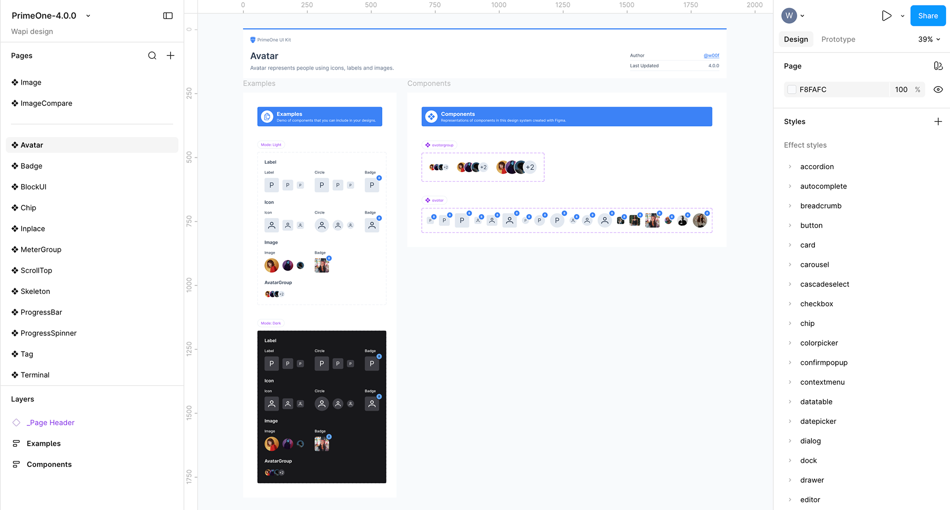
The kit as purchased.
The design challenge
By the time I joined, the developer had already started building.
He had the architecture mapped out and a few screens running — deliverables built to validate business logic with the client, not to be used. They answered "does the system understand how a loan actually works?", not "what is this like to use every day?".
So my job wasn't to start from zero. It was to step into a system already in motion and give it the shape of a product without stalling development.
That meant two things:
* Accepting the logic. The business model the developer had built was sound. I didn't touch it.
* Challenging the structure. Whenever the architecture collided with the experience, I raised it, we argued it through, and we changed it. We reorganised where things lived more than once — even when the underlying logic stayed exactly the same.
* Accepting the logic. The business model the developer had built was sound. I didn't touch it.
* Challenging the structure. Whenever the architecture collided with the experience, I raised it, we argued it through, and we changed it. We reorganised where things lived more than once — even when the underlying logic stayed exactly the same.
Design system: a delivery decision, not an aesthetic one
We chose Prime One, and we chose it together, before a single screen was designed.
The reasoning was simple. The developer was building in Angular, and PrimeNG was the library that suited him best. If I designed with that library's own kit, every component I handed over already had a counterpart in code — under the same name.
In practice, datatable, paginator, inputtext, toast and tabs meant the same thing in Figma and in the repo. Handoff stopped needing translation.
What I adapted:
* Replaced the kit's default purple with the client's brand colour and rebuilt the derived palette around it.
* Built from scratch the components the kit didn't ship: summary cards, data lists and alerts. Prime One is a UI kit more than a design system — it gives you parts, not principles — so I built these following its own token logic, to keep them from reading as grafts.
What I adapted:
* Replaced the kit's default purple with the client's brand colour and rebuilt the derived palette around it.
* Built from scratch the components the kit didn't ship: summary cards, data lists and alerts. Prime One is a UI kit more than a design system — it gives you parts, not principles — so I built these following its own token logic, to keep them from reading as grafts.
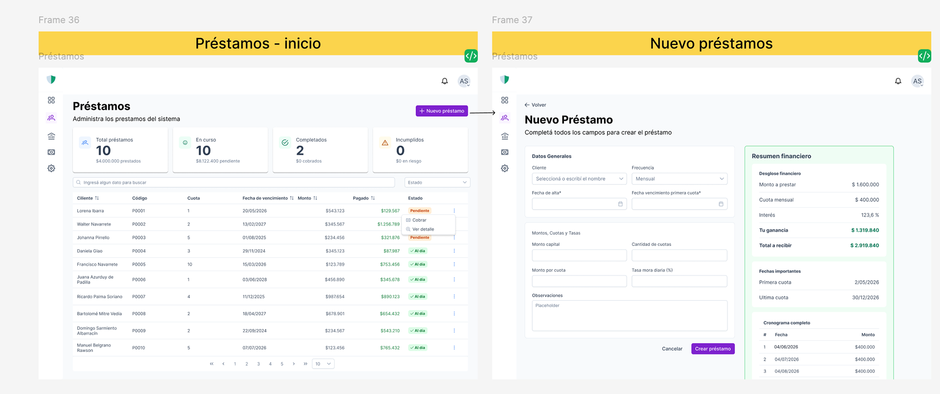
Creating a loan takes the full screen. High stakes deserve undivided attention.
Design decisions
1. How much decision to put inside the table
The clients table was the most settled part of the product from day one: the architecture already defined it and the structure worked.
The question wasn't how it looked. It was how many actions to give the user inside it.
A table can become a control centre — inline editing, status changes, quick actions. But every action you add is another decision the user has to make while scanning rows.
We decided the table would do one thing well — find someone and open them — and that anything with consequences would live in the client record or in a flow of its own.
Decidimos que la tabla hiciera una sola cosa bien —encontrar y entrar— y que las acciones con consecuencia vivieran en la ficha del cliente o en flujos propios.
2. Adding a client, in two levels
Creating a client asks for a lot: personal details, contact, guarantor, notes. All at once, it's a form that's exhausting before you start.
I split it into two levels inside the same panel: personal information always visible, additional information revealed only when needed.
Adding someone quickly is four fields. Filling out the complete record is still there — it just isn't imposed on you.
3. New loan gets its own screen
This is where I broke the product's own pattern.
Everything else works through side panels over the table: you see the list and work on top of it. But creating a loan isn't like adding a contact. It's the highest-stakes moment in the business — amounts, terms, interest, instalments, collateral. A mistake here follows you for months.
Creating a loan takes over the full screen, as a separate flow. Pulling it out of the table's context wasn't a visual choice: it was a way of telling the user that what they're about to do is different and deserves their attention.
4. What the summary cards should show
The cards produced the longest discussion and the least code.
Three numbers at the top of each module. The question was which three. It's the first thing he sees when he opens the system, and it's effectively the answer to "how am I doing?".
5. Where cash lives
Cash was the hardest module to place.
Every payment recorded in Collections is also a movement of money. Every loan granted is money going out. So: is Cash a view of what happens in the other modules, or a place where you also record things that don't come from any loan at all?
That was an architecture question, but the answer changed the experience completely. We worked it out together.
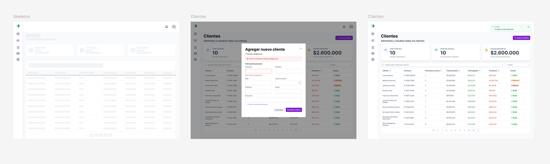
Loading, confirmed, failed. For someone who already lost his records once, these aren't details.
The detail that makes it feel like a product
The original ask was stability. And in an interface, stability is felt in the moments where something could go wrong.
* Loading skeletons on tables and cards. The system never goes blank — it shows the shape of what's coming.
* Explicit confirmation after every action. Saving a client returns a message, not silence.
* Errors that don't destroy your work. If a save fails, the form stays exactly as it was, data intact, with the error above it.
* Explicit confirmation after every action. Saving a client returns a message, not silence.
* Errors that don't destroy your work. If a save fails, the form stays exactly as it was, data intact, with the error above it.
For someone who has already lost his records once, being told that an action worked isn't a UI detail. It's the reason he trusts the system enough to stop using the spreadsheet.
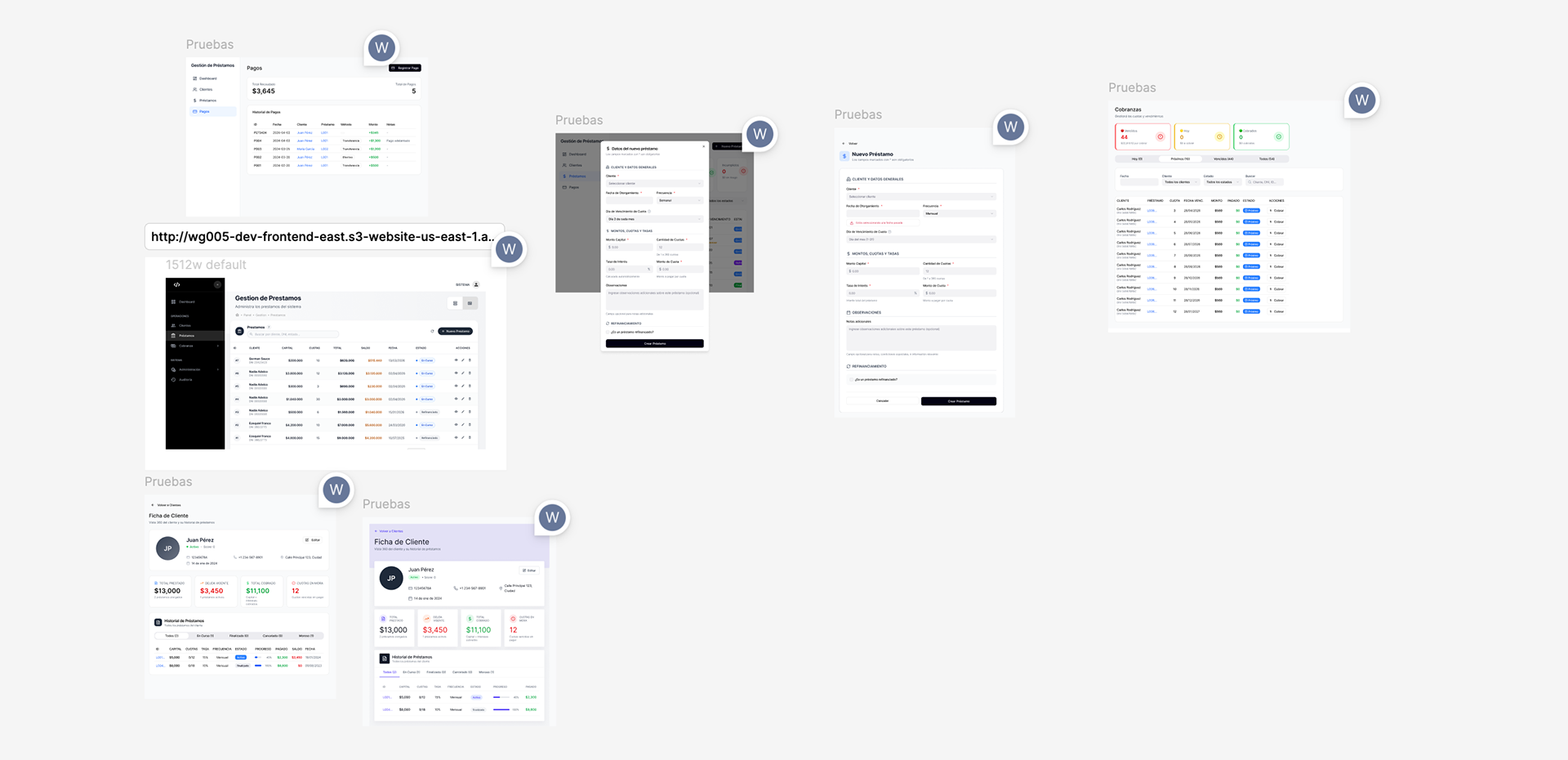
The built product imported back into Figma, marked up against the design.
Design QA against the real build
Once the developer started pushing modules to the dev environment, I imported the built screens back into Figma with html.to.design and set up a corrections page.
There I marked the gaps against the design, directly on the real build: spacing, hierarchy, states that had been implemented differently.
It wasn't a list of complaints. It was a shared worklist that replaced "this isn't what I designed" with "this is what exists, this is what's left".
Outcome
The platform is ⟦in production / in development — confirmame⟧ and the client no longer depends on a file sitting on a single machine.
There are no usage metrics yet. What I do have is what happened as we delivered. He had been looking at development screens — functional, undesigned, built to validate logic. When the first designed module landed, something shifted. He stopped treating it as a tool and started treating it as his product.
What's next: today the system is his alone. The next phase opens access to borrowers, so they can see their loan, their instalments and their payments without having to ask him over WhatsApp.
What's next: today the system is his alone. The next phase opens access to borrowers, so they can see their loan, their instalments and their payments without having to ask him over WhatsApp.